As per Micki’s request in the comments of my last post, here’s a photo of the ugly birch fabric:

It’s a Northcott Lyndhurst fabric designed by Janet Orfini as a part of the Farmer’s Market series. I found it in the country-kitsch (and I mean that non-derogatorily) section of a local fabric store.
The realm of prints in these sorts of series (i.e. Thimbleberries and other country-style collections) usually don’t appeal to me personally as a theme or colour scheme for a quilt. I’m also not much into farm prints, chickens, cows or scarecrows. The individual textures of all of these things, however, fascinate me mightily.
I can see how other people might like these collections for their intended purposes, though, and have found that the often dull or muted tones of certain fabrics can be extremely useful in landscape quilting. So it’s a section that I frequent, when I’m not painting my own fabric, but not, I suspect, for its most popular use.
Actually, one of the ugliest fabrics I’d ever seen (and we’re talking truly hideous) turned out to have just the right textures (looked like moldy wood) to serve as the background fabric for the tree in this picture:

You see those spots? Yeah, they look fine for the tree, but as a whole sheet of brown, grey and taupe covered in what I swear resembled mildew, it was entirely unappealing.
This is why I don’t throw out ugly fabrics that happen to be in the colour schemes in which I often work. Thus far, just about every ugly fabric has served a very unique and essential purpose in some piece or other. I’m usually quite dubious at the outset, but it always seems to work out.
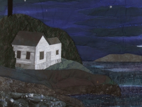
The piece below contains three or four almost-ugly fabrics. The trees, in the background, behind the house? Unattractive grey-green that I used as the basis for enhancing with fabric pastels. Some of the rock and grass fabrics were also entirely unappealing, although not truly into the realm of hideous. Sometimes an ugly fabric can be transformed when cut up into smaller pieces. Sometime it takes chopping out or covering over certain blotches or areas. Quite regularly, I over-paint, add details or over-dye fabrics that have the right texture, but need a colour change. Occasionally, as in the trees below, the colour is right, but the texture needs to be created.

So treasure your uglies, especially if they are in anyway reminiscent of your usual colour schemes or creative habits!
Incidentally, if you haven’t already checked out Micki’s blog, it’s well worth a regular read. Recently she posted about burning the bejeezus out of painted Tyvek, a trick I’ve wanted to try for a while but am holding off on until I can do it outside (bad fumes). Summer’s coming, though!

Thanks for showing the fabric and the other pieces as well. I have been known on occasion to buy that ugly fabric with something similar in mind as you have mentioned.
Also thanks for the mention of my blog. 🙂
Ugly fabric to one person is another persons treasure. Also, you may be able to cut up a design and sew to another print and make a design that will fit your needs. Great blog and nice pictures.
I happened upon your website by accident, but I am pleased to
see that I am listed. I would like you to know that I do workshops in printing textiles for quilters and fibre artists. If you
have something in mind that you can’t find, you should know that you can produce your own textiles at a reasonable cost.
Enquire about workshops/printing. Contact info: atelier.west
@nf.sympatico.ca Contact person: Audrey Feltham