I’ve been playing with colour schemes for yarns and fibres and am trying to avoid replicating other folks’ ideas. While it ought to be easily done (figure out idea, check and see if anyone else is doing something uncannily similar, nix or continue based on results), it’s harder than it looks. (Here’s a fun linky-dink for those who want to build colour schemes, juxtapose hues or see what other people have put together. Looks useful for a myriad of purposes.)
Colour schemes are very much like an accent or speech mannerism. If you are tuned in to the subtle nuances of speech or have an ear for language, you sometimes find yourself inadvertently mimicking those to whom you are speaking. I once had an entire conversation in a Texan accent with an American tourist without realizing it. I am not remotely Texan. (He was, but he was also of good humour, thank heavens.) Hue combinations have a similar tendency to fix themselves in one’s mind’s eye and crop up inadvertently.
I expect that a certain amount of copy-cat behaviour is natural in any medium in which ideas are soaked up into the brain sponge and percolate for a while before rearranging themselves into something rather new. Since dyes come in specific colours and since certain colour schemes are more appealing than others, it is almost inevitable that two artists will produce very similar results without ever being aware of each others’ work.
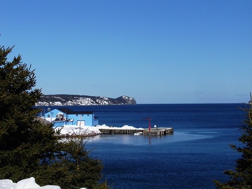
My current colour play involves two colour categories; natural colours of my environment (Newfoundland & Labrador) and building and boats of the same. The natural colours are proving far easier; greens, blues and flower hues combined with greys, browns, rock colours and so forth. It’s the buildings and boats that have me a little stymied because there are really two separate Newfoundland paint colour sets; traditional and contemporary-traditional.
Traditional Newfoundland building colours were dictated largely by the colours of boat paints. Boat paint was cheap, came in limited colours and resisted the elements (salt water spray, wind, rain and snow) very nicely. Stages or outbuildings seem to have been more garishly adorned than principal living structures, however even these were often white (which was also cheap), sometimes with colourful trim (again, boat paint).
I found a company, George Kirby Jr., in New Bedford Massachusetts (USA) makes boat paints in traditional or historical colours. Note: I recognize that this is an American company, but many of their colours appear to be those often used around here, too.
Here’s their colour chart (which is not strictly accurate due to variances in screen colours, etc.) of traditional colours:
What’s interesting to my viewing is the array of greens, the complete absence of purple and the relative scarcity of blues and yellows. There are quite a few of what could be considered fairly dull or slightly muddy colours (greys, taupe, seaweed, etc.) by today’s standards. Of course, slapped on something the size of a house and a paint sample can go from drab to garish in very short order! I wonder if these colours were considered brighter then and if technological advances in colour mixing have enabled companies to mix clearer or brighter colours.
I’ve been collecting photos of older buildings, still coloured with these older tints of paint and have realized that I need more pictures. The few I have seem to focus on reds and yellows. Have a look:
Of course, this has made me realize that I need more photos of Newfoundland buildings and houses. Nice to have an excuse for a photographic exploration!


I find it interesting to read your blog as I live in Poole, Dorset in the UK and we have very strong links with Newfoundland historically. I think alot of our people settled over in Newfoundland and started new lives there. It looks very beautiful.