I’ve been working through the concept of stone wall construction in churches and ruins and have been struggling with how to add depth to the pieces. The quick study of a ruined arch at dawn has since been quilted and, while it’s difficult to see the texture and depth added to the piece through the stitching in this photograph, the result is a subtle curvature to each individual rock.
The sparkly stuff is shredded lamé overlaid with sparkly tulle. Initially, I had quilted a traditional feather design that started in the lower right corner and swooped upwards, but that just wasn’t working, so I added the lamé and tulle, quilted with swirls. In my mind, it simultaneously represents the mists of dawn and the enduring spirit that inspired the construction of the building. (You’re welcome to find your own meanings, of course, as always.)

So then I went back to working on the arch on tissue/glue/dye paper and hummed and hawed over that for a bit. After a bit of experimentation, I discovered exactly how flat things look when ironed to paper and how, when the paper itself is wrinkled, the resulting adherents are also wrinkled-looking. This wasn’t what I was going for, but I still wanted to be able to see the background between the rocks. I came up with the idea of ironing the rocks to a sheer fabric and overlaying that on the paper background.
The problem with that concept is that most sheers (at least the ones I have currently in stock) fuse at a lower temperature than the cotton. Essentially I’d fuse the cotton to melted goo. Not appealing for this project. Then I remember my painted cheesecloth collection.
Whenever I paint fabric, I take the left-over paint and dump it onto cheesecloth and let the cloth dry. I now have a bizarre assortment of hand-painted cheesecloth pieces that are beyond useful. They’re amazingly good for all sorts of bizarre textures. And they’re cotton.
So I fused the rock pieces to the cheesecloth and made a quick study to see how it looks. Here’s a detailed shot of the stones on the cloth:
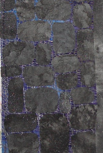
As an added bonus, painted cheesecloth doesn’t unravel as much as the plain or dyed cheesecloth; the paint acts as a sort of a binding agent. Very handy.
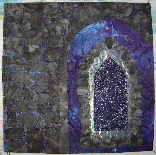
Here’s the almost complete mini-study I made last night as prep for the larger pieces to be started today. This morning I added silver foiling to the outline of the interior window and outlined a bit of detailon the window’s framing in silver as well. This piece is a scant 6″ square. Here’s a quick look (before foil):
To round things off, I’ve started planning the borders for the Ferryland Lighthouse piece. I’m getting somewhere. I think.


I like seeing your work on this project. If you wish to add more (and varied) appearance of depth to the rock walls, you can go into the pieces with a watercolor pencil. Add a small highlight to one rock, a shadow to another. Or add the slight touches of color that lichens add to these walls. A wet, but not dripping brush then blends the the colors into the fabric.
I am enjoying seeing the process of your work and how you do your various techniques.
thanks for sharing.
Thanks Micki! I like writing things out. I find it clarifies in my mind what I’m doing and working through the processes I use often triggers new ideas.
Debra , I dug out the watercolour pencils and tried just what you said. It worked fabulously, especially on the lighter rocks. Thanks!!! I’ll post comparison (before and after the watercolours) photos when next I empty the camera! I really appreciate the tip!