I’m not sure how many places named “Freshwater” there are in Newfoundland.
John and I have a running joke, whenever we encounter one, in which we start reeling off the Freshwaters and associating them with events or features that make them unique. For instance, there’s Freshwater-where-we-camped-near Motion-Head, Freshwater-with-the-big-beach-on-the-way-to-Cape-Spear, Freshwater-down-Placentia-way-with-the-trail-that-we-haven’t-done-yet, Freshwater-near-Carbonear-with-the-marvelous-old-houses-and-root-cellars and so forth.
In fact, I would venture to posit that every major community in Newfoundland has a satellite cove, often resettled now, that is called Freshwater. It makes sense, when you think about how important water was and the fact that many of these coves were named by navigators and mappers on ships. Ships that have travelled any distance have several key priorities and replenishing the water supply in an accessible area is top among these.
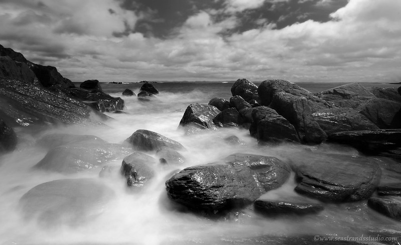
I was playing with the ND filter and a wide angle lens for the shot above. Something I’ve not had a really good chance to do lately is to fiddle with that filter and the lens in combination to achieve results that reflect my initial intentions. This is getting closer, but it still isn’t quite what I was looking for. I tried it in colour, but it’s better in black & white, I think.
Feel free to disagree or comment!


Amazing!!! I agree that it’s more visually striking in black and white. Love your photos.
I like the bw version best, love the freshwater-statements-in-your-blog, thanks 🙂 MJ
Had to go between both quite a few times. I agree that the B/W Is slightly more stunning but I would be very proud of the color version too!
Yes, I was back and forth a good bit. The sky colour in the original looked slightly more surreal than I would have liked (even though it’s actually acurate), so I wondered if the coloured version would look over-processed, despite not being so.
Black and white is my favourite, great picture
Thanks! Setting it up was great fun, but a real challenge, with a dog tied to one ankle.
aww!
I like b/w most aswell because, although the colour is nice and all but it looks like its already b/w AND colour because of the dark rocks which makes it look pretty cool… I don’t know! They are both nice 😉
Thanks! Yes, I waffled a bit on this one. I keep coming back to the b&w one, too.
B&W enhances the mist/spray element. Definitely b&w. Great shot!
Thanks!! I’m quite pleased with how it came out.